Always on the lookout for the iOS weather app, I followed Shawn Blanc’s (among many others) recommendation for Check the Weather. I like its simplistic display of only the most necessary information and more detail is just a swipe away.
However, I do disagree with one of Shawn’s main “stand out” points; the use of the Idlewild typeface by Hoefler & Frere-Jones. I almost feel bad saying it, because I’m a huge fan of many of their typefaces, but Idlewild is not one of them. The app’s developers say it was “chosen for its distinctiveness and strangely vintage, futuristic look.”
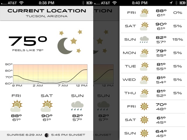
Strange indeed, because I find the information hard to read on the iPhone screen at any appreciable distance. I can think of any number of H&FJ typefaces that would have been a better choice; Gotham, Ideal Sans, Tungsten–heck, considering the purpose of this app, Numbers would have been an inspired choice. Anything would be an improvement over the current selection, which unfortunately is a case of cleverness outweighing legibility.
Update (Oct 29): An update released today adds Futura and Helvetica as font choices.
Note: See that one bar I’m getting with my phone sitting on my desk? Yeah, me too. Verizon here I come.