The main Lab page and the Typography Page are fixed width, which is 960 pixels. This page is laid out on a flexible grid, thanks to Ethan Marcotte's excellent book Responsive Web Design. The grid itself (and defined by the #wrap element) is 960 pixels wide. The grid consists of 12 columns of 58px each, with 24px gutters. To see the grid, click the button in the upper right corner of the browser window. Another tool I’ve used is a bookmarklet from Javascript.org that I keep in my bookmark bar in Safari. The former is good in that users can see it and also has an option to display horizontal lines so that the layout grid and the vertical scale can be displayed at the same time. The latter is less obtrusive and good for development work.
The width of the content and sidebar elements in pixels is determined by how many columns and gutters each takes up. These pixel widths are then converted to percentages so that when the browser window is narrowed below 960px, the proportions are maintained. The center content is floated left, but has a left margin equal to 3 columns and three gutters. The article dates, tags and sidenotes are then floated left as well, but with negative left margins to pull them into content's large left margin. The math here can get out of hand, so I use an Excel spreadsheet that does it all for me. I set the parameters of the grid, and how many columns and gutters each element uses in desired width, and it spits out the necessary percentages that I put in the CSS.
And yes, typographically this page isn’t much to look at—that’s what the Typography page is for—but it makes the CSS easier for me to tweak. Eventually the best of both pages will merge.
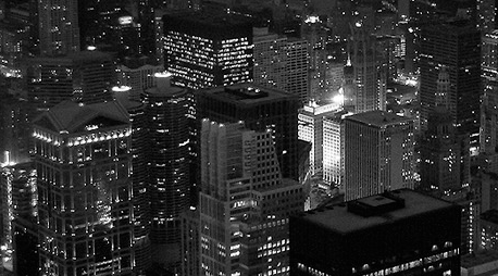
That should be a flexible image. It should resize as the text column is narrowed.
A Note About Flexible Images
Ethan Marcotte's book, as well as a blog entry by Richard Rutter, talk about flexible images—images that resize as the browser is resized (see Media Queries below). This was simply done in the first version of this page by doing two things: removing the 'width' and 'height' attributes of the img element:
<img src="img/city.png" alt="city picture" />Secondly, in the CSS, setting the img width to 100%. Now when the browser window is resized, the image will resize as well and maintain the full width of the content column. Give it a try.
This is all you need if you don’t apply padding, borders, and a possible background color to the img element to give it a frame. But I did, so a slight variation is needed. At full width, the content columns is 468px. I want 4 pixels of padding on each side as well as a 1 pixel border. Given that, the image width should be 458 pixles: 4 + 4 + 1 + 1 = 10. All that is needed is to change the img width in the CSS to 97.863248% (458 /468) and add the desired background color, padding and border:
.article img	{
	float: right;
	width: 97.863248%;
	background-color: #eee8d5;
	border: 1px solid #657b83;
	padding: 4px;
	margin-bottom: 24px;
	}
Yes, it takes some planning and image manipulation up front to get images the correct width (458px), but we are doing that anyway in order for images to keep the vertical rhythm intact—see the Typography Page—which is also why the bottom margin has been set to 24 pixels.
A sidenote after the paragraph in source.
One more thing going on here is the img is floated right. Why? Because the "caption" over in the left margin is actually in a paragraph tag that has a class of sidenote. Those come directly after the image in the source and are floated left. The opposing floats keeps them aligned along their top edges.